Glovo
Through user research and feedback analysis, it became evident that Glovo users faced significant challenges in accessing customer support. Users reported frustrations with:
• A lack of contact options (no email, phone number, or streamlined support page).
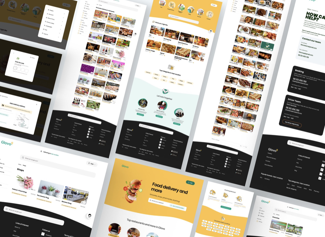
• Confusing visual hierarchy that made it hard to navigate critical sections.
• Delays in refund processes, adding to user dissatisfaction.

Key Insight:
The absence of a dedicated and organized “Contact Us” page created barriers to effective communication for customers, drivers, and store owners.
Research and Insights
To validate these pain points, I conducted user research using App Store reviews and user feedback:
• Users couldn’t easily contact support after payment issues or canceled orders.
• Drivers and stores lacked clear onboarding/contact channels.
• Navigation issues like poor font hierarchy, unclear footers, and confusing layouts increased frustration.
Reflection
This case study taught me the importance of listening to user feedback and designing solutions that tackle real-world challenges. By focusing on accessibility and visual clarity, I was able to transform user frustrations into a seamless, organized experience.
Design Process
To emphasize the problem-solving journey, I followed a user-centered design process:
• Research Phase: Analyzed reviews, user journeys, and identified primary pain points
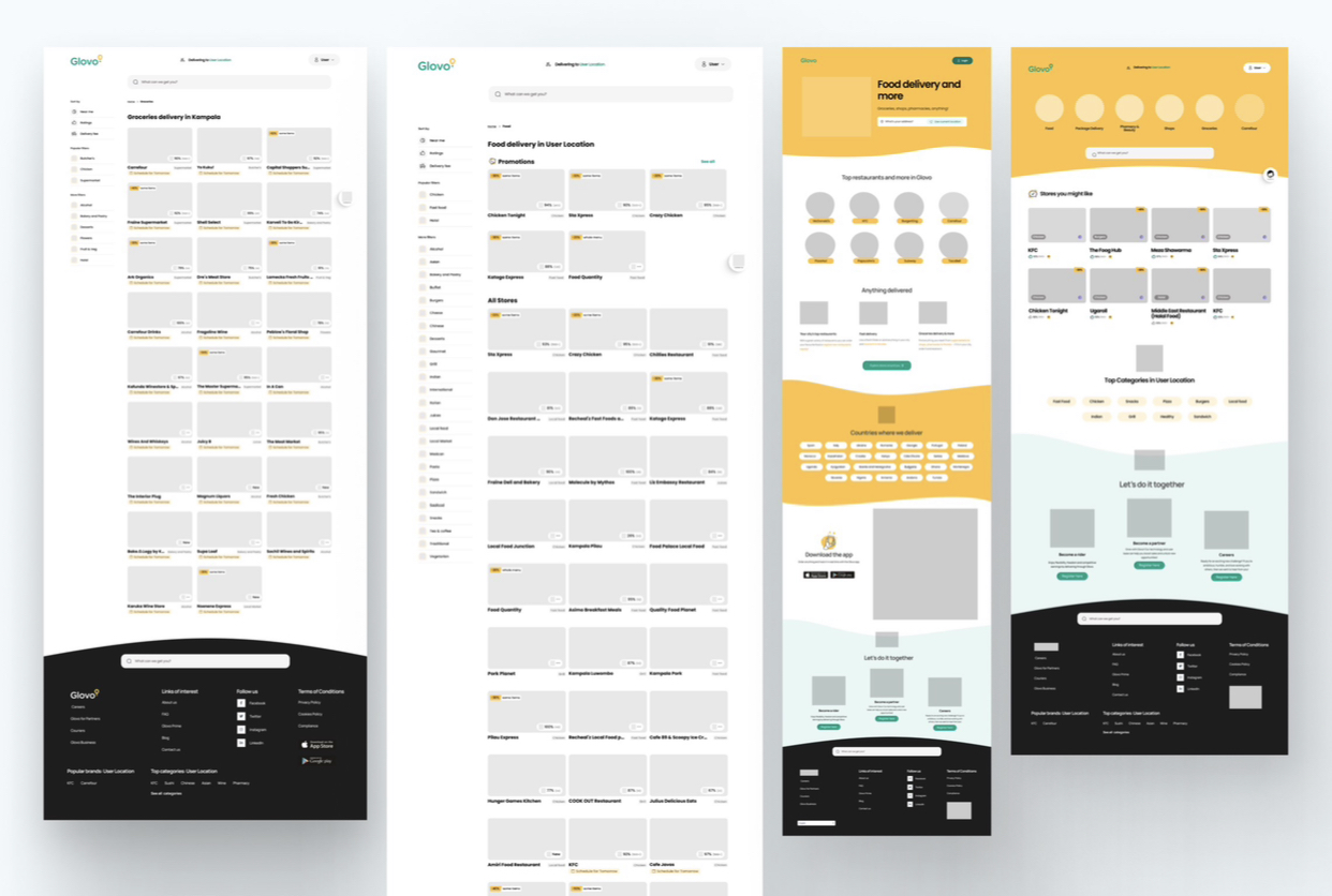
• Ideation: Created sketches and wireframes to visualize solutions.
• Prototyping: Built interactive prototypes for the “Contact Us” page and layout improvement
• Iteration: Incorporated feedback to refine design elements for clarity and usability.
Next Steps:
Further usability testing to gather insights for continued improvements.
